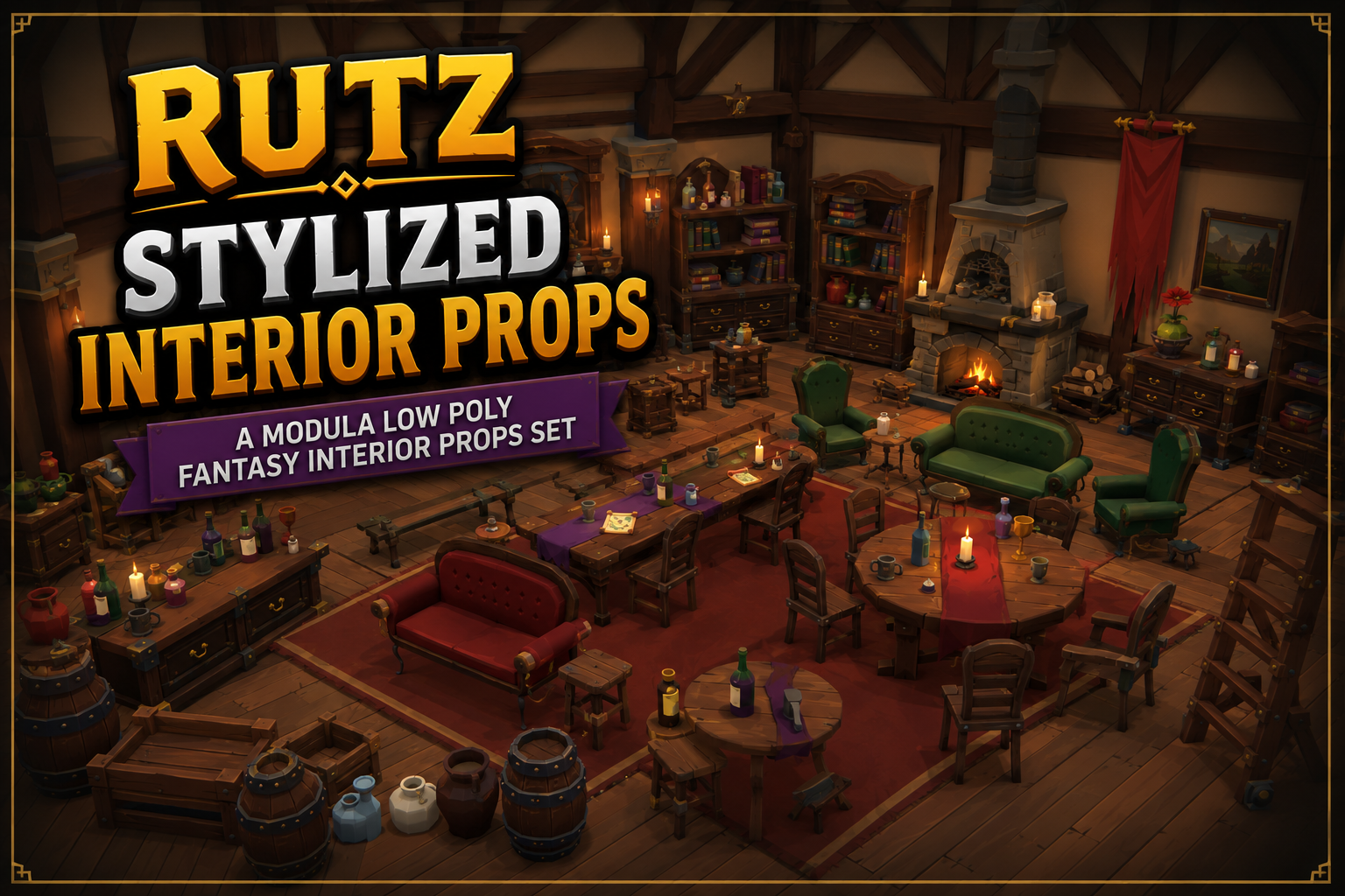
Fantasy Interior Set Dressing in Unity: Why Your Tavern Feels Empty
The tavern that never feels like a tavern
You blocked out the room two weeks ago. Four walls, a front door, a staircase up to the guest rooms, a fireplace on the far side. The lighting is warm, the wood material reads nicely, the collision is clean. You drop the player in, walk them through the door, and nothing happens. It looks like a room. It does not feel like a place where anyone has ever eaten a meal, argued about money, or fallen asleep in a chair.
Almost every solo developer and small team runs into this exact wall. Architecture turns out to be the easy half of interior work. You can learn to build a convincing shell in an afternoon. What separates a shell from a location is the hundred small objects that imply a life happening off screen, and those objects are expensive in a way that walls simply are not.
Why "just add more props" is bad advice
The usual feedback on an empty interior is to fill the space. That is technically correct and completely useless. The reason your tavern is empty is not that you forgot to fill it. It is that filling it properly means modelling, unwrapping, texturing, and optimising somewhere between 80 and 150 distinct objects, most of which the player will look at for half a second. Tables, benches, stools, shelves, cabinets, barrels, crates, bottles, cups, plates, pots, pans, bread, cheese, candles, lanterns, rugs, curtains, books, scrolls, and the one strange item that makes the room feel authored instead of generated.
Each prop is maybe 40 minutes if you are fast and your pipeline is dialled in. Multiply that out and interior dressing for a single building becomes a two month side quest. For a game with an entire village in it, the maths stops working. That is why so many indie RPG interiors end up as three tables, one barrel, and a lot of visible floor.
Set dressing is a content problem, not a taste problem
It helps to name the problem correctly. Most developers who struggle with interiors do not have a bad eye. They have a starved library. Hand the same person 200 cohesive props and they will dress a believable inn in an afternoon, because the actual creative decisions (what goes where, what tells a story, what the player reads first) are quick once the raw material exists.
The trap is scavenging props from five different sources. A photoreal cooking pot sitting next to a hand painted low poly chair next to a mid poly bookshelf with completely different texel density reads as visual noise. The room gets busier without getting better. Style consistency matters far more than the quality of any single object, which is worth remembering the next time a very nice free model tempts you into a style clash. If you want the longer version of that argument, our piece on building levels with modular environment kits covers why cohesion beats variety almost every time.
A room does not become real because you added expensive objects. It becomes real when everything in it looks like it came out of the same world.
The three layers that make an interior read
Layer one: furniture that defines function
Long tables and benches say "common room". A counter with bottles racked behind it says "you can buy things here". A carved bed and a wardrobe say "someone sleeps here and they are doing fine financially". Before you place a single small object, decide what the room is for and let the large silhouettes announce it from the doorway. It is the same instinct you use during a level blockout and greybox pass, just at furniture scale instead of building scale.
Layer two: clutter that implies a person
This is the layer people skip, and it is the layer that does the real work. A half eaten meal. A cup knocked on its side. Three bottles clustered at one end of a table and none at the other. Cookware left out near the hearth. Clutter is how you show that the space was occupied five minutes before the player walked in. Perfectly symmetrical prop placement is the fastest way to make a room feel like a furniture showroom.
Layer three: the soft stuff
Rugs, curtains, banners, cushions, cloth runners. Fabric breaks up hard geometry, softens the eye, and adds colour in places where wood and stone are doing nothing. A tavern with one red rug under the central table reads warmer than the same tavern without it, and it costs you almost nothing at runtime.
A prop library built for exactly this job
This is the gap that Rutz Stylized Interior Props is built to close. It is a modular low poly fantasy interior set aimed squarely at the developer who has good rooms and nothing to put in them. Furniture, kitchen and tavern equipment, dining props, decorative pieces, and modular interior assets, all authored under one art direction with clean silhouettes and game ready optimisation.
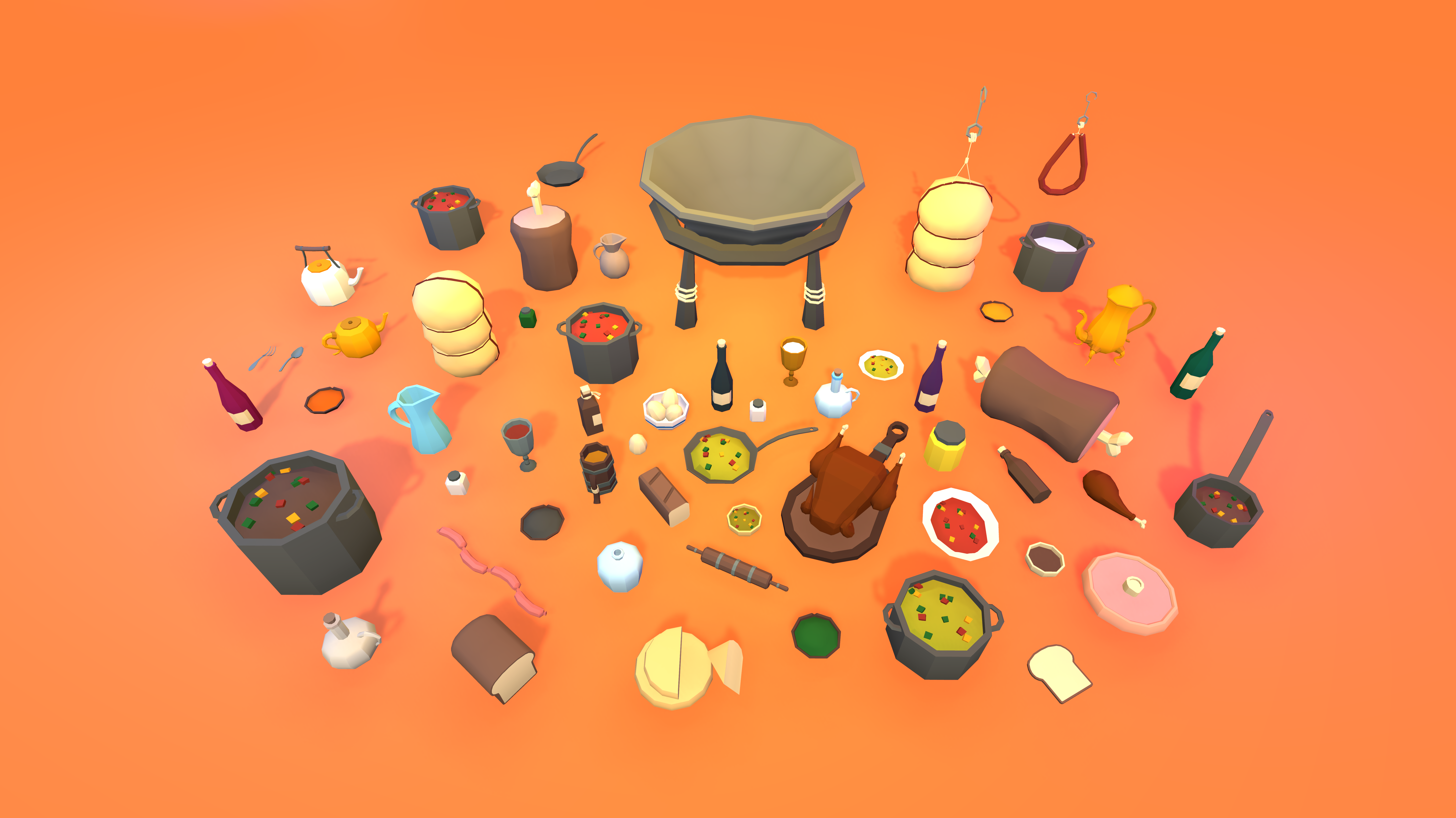
The furniture side covers the pieces you always need and never want to model: tables, shelves, benches, chairs, cabinets, chests, and barrels, with enough variants that a row of them does not look copy pasted. The tavern and kitchen side is the part that surprised me. Cookware, cauldrons, bottles, cups, serving plates, loaves, cheese wheels, roasts, and stew pots that are already plated and ready to drop on a table. That is the "someone lives here" layer, prebuilt.
Scholarly and story props matter more than you think

Telescopes, globes, open books, scrolls, an hourglass, a lantern. These are the props that turn a generic room into a specific character's room. A wizard's study, an alchemist's back room, a cartographer's office, a guild master's office upstairs from the hall. Set dressing is characterisation, and a globe on a desk does more silent storytelling than a paragraph of dialogue.
Who this is actually for
If you are building an RPG, a survival game, a cosy management sim, an adventure game, or a tabletop style dungeon crawler, and your interiors are the weakest part of your build, this is the shortcut. It suits Unity and Unreal developers equally, and it is a particularly good fit for anyone already using a stylized low poly exterior kit who now needs the insides to match.
It is less useful if your project is going for grounded realism, or if you already have an established interior style with its own texel density and colour language. Style mismatch is the one thing a prop pack cannot fix for you.
How to use a prop pack without it looking like a prop pack
Three habits go a long way. First, rescale. Nudge a few props to 0.9 or 1.1 so identical meshes stop reading as identical. Second, rotate off axis. Nothing in a lived in room sits at a perfect 90 degrees. Third, tint materials per room. Warmer wood in the tavern, cooler wood in the basement storeroom, and suddenly two rooms built from the same 30 meshes feel like different buildings.
One more: build small prefab clusters. A tray with a cup, a plate, and a bottle already arranged. A shelf with its books already placed. Drop clusters instead of individual objects and you will dress rooms roughly four times faster, with better composition, because you made the composition decision once instead of forty times.
Worth the trade
At $14.99 the arithmetic is not complicated. If a prop pack saves you even 20 hours of modelling and texturing, it has paid for itself several times over, and the hours you get back go into the systems and writing that actually differentiate your game. Nobody has ever finished a game because they personally modelled the cheese wheel.
If your interiors have been the thing you keep putting off, take a look at the full render gallery on the Stylized Fantasy Interior Props product page on DevLoot, see whether the art direction lines up with your project, and go dress that tavern properly.