
TTRPG Character Sheet Design: What Makes a Sheet Players Actually Enjoy Using
Here is a test almost nobody runs on a roleplaying game, and it predicts more about how the first session feels than the rules do. Hand a stranger your character sheet, say nothing, and give them sixty seconds. Then ask what their character can do. If they can answer, the sheet is doing its job. If they squint and ask which of the four numbers in that corner is the one you add, the sheet is going to cost you an hour of table time every single week.
Character sheets get treated like paperwork. They are actually the interface. The rulebook is the manual you read once and shelve. The sheet is the screen your players stare at for the entire campaign, and it teaches the game whether you designed it to or not. A good one answers questions before anyone asks. A bad one turns every roll into a scavenger hunt.
The sheet is a teaching tool, not a filing cabinet
The common failure is treating the sheet as storage. Every stat the game defines gets a box, the boxes get arranged to fit the page, and the layout ends up organized by category instead of by use. Skills over here because they are skills. Equipment over there because it is equipment. It looks tidy and it plays terribly, because at the table nobody thinks in categories. They think "I want to hit that thing" or "I want to talk my way past this guard," and then they hunt.
Sheets that work are organized by moment of use. The numbers you touch in combat sit together. The things you consult once per session live at the edges or on the back. Anything you reference constantly, like your core defense or your primary roll, gets the visual weight of a headline. Designers who write about layout keep landing on the same idea: a quick look at a character sheet should tell you what kind of game this is and what your options are as a player. That is a real design goal, not a nice-to-have.
If a player has to ask where something is more than twice in a session, that is not a player problem. That is a layout bug.
What the good ones actually do
A few habits show up again and again on sheets people praise.
- They print the procedure, not just the value. Instead of a blank box labeled Save, they write the actual instruction next to it. Roll under. Roll 2d6 and add. Compare to the target. The sheet becomes a rules reference you cannot lose.
- They use one page when they can. Story games and Powered by the Apocalypse playbooks have this figured out. One page means no flipping, and no flipping means faster play.
- They build character creation into the sheet. The original Mothership sheet is the famous example here, folding a character creation flowchart into a usable play aid. First edition Mothership went on to sweep several categories at the 2025 ENNIE Awards, including Gold for Best Production Values for the Deluxe Set. Presentation is not decoration in this hobby. Judges and players both notice.
- They leave room for handwriting. Designers fill boxes on a screen at 200 percent zoom and forget that a real person writes "Longsword +1 (1d8, versatile)" with a ballpoint pen in a dim room. Line height matters more than font choice.
- Some of them turn sideways. Landscape sheets take up less depth on a crowded table, which leaves room for maps, snacks, and dice trays, and they give you more left-to-right space to separate different parts of a character. It is a small change that solves a real physical problem.
The three-zone rule
If you want one framework to redesign a sheet with, use this. Split the page into three zones by how often a player touches them.
Zone one, every roll. Core attributes, the primary roll mechanic, defense, current health or its equivalent. This zone gets the top third and the biggest type. It should be readable upside down from across the table, because your GM will be reading it that way.
Zone two, every scene. Skills, abilities, gear that gets used, resources that deplete. Middle of the page, grouped by what a player wants to accomplish rather than what the rulebook calls them.
Zone three, between sessions. Backstory, relationships, notes, advancement tracks, inventory that is really just storage. Back page or bottom margin. Nobody needs their character's hometown during initiative.
Most bloated sheets get fixed by moving three or four things from zone one to zone three. That is usually the whole job.
When the sheet carries the theme
The most interesting sheets do something beyond bookkeeping. They put the game's actual subject matter on the page, so tracking your character and playing the theme are the same action. A horror game that tracks stress in a visible bar is telling you what the game is about. A political game with a relationship map on the front page is doing the same thing.
A clear example on DevLoot is the character sheet for Faith, the Christian tabletop RPG from Rutz Studios. It is a two-page sheet, and what it tracks is the design statement: the Fruits, the Faith Die ladder, the Armor of God, spiritual gifts, and a prayer journal section. Whatever your own background, it is worth looking at as a design object. The mechanics that define the game are not buried in a rulebook chapter. They are the layout. A player filling in that sheet is being walked through what the game cares about, which is exactly what a sheet should do.
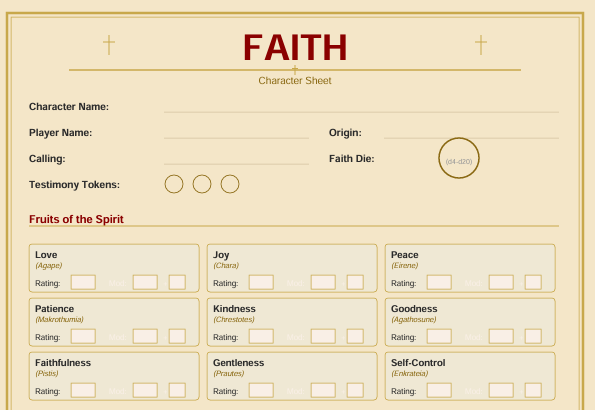
The Faith Character Sheet on DevLoot, a two-page sheet built around the Faith Die ladder and the Fruits.
It is a dollar, which makes it a cheap way to study how a designer maps a specific theme onto a page. If the system itself interests you, the Faith Core Rulebook is the full game, and The Shepherd's Companion is the GM guide for running campaigns with it. If a faith-themed table is not your thing, the design lesson still holds, and we covered the wider niche in our piece on faith-based tabletop RPGs.
Testing your sheet without a focus group
You do not need a research budget. You need four checks.
- The sixty second test. Hand it to someone who has never played your game. Can they tell you what the character does? If not, your hierarchy is wrong.
- The upside down test. Look at it from the GM's side of the table. The numbers a GM asks for, usually defenses and passive scores, should be findable from that angle.
- The pencil test. Print it. Actually fill it in by hand, with a real pencil, during a real session. Every box that is too small will announce itself in about ten minutes.
- The blank stare test. Watch where players' eyes go when they are about to roll. If they scan the whole page every time, the thing they need is in the wrong zone.
Print, PDF, or both
A fillable PDF is convenient and it removes the joy of scratching out a wound track, which is a bigger deal than it sounds. Most tables land on a hybrid: a fillable version for people playing remotely, and a printable version that respects the physical realities of paper. If you are designing a sheet to sell or to share, ship both, and make sure the printable one still works in black and white. Plenty of players print at the office.
Start with one change
You do not need to redesign your sheet tonight. Pick the number your players ask about most, make it twice as large, and move it to the top of the page. Run a session. See if the hunting stops. Then do the same thing with the next one.
If you are still finding your feet behind the screen, our guide on running your first session as a new GM pairs well with this one, since a clean sheet removes a good chunk of first-session friction. And if you want to see how other designers solved the problem, browse the tabletop section on DevLoot and pull up a few sheets side by side. Reading other people's layouts is the fastest way to improve your own.